Colour Psychology in Upholstery: Shaping Mood & Elevating Luxury Interiors
In luxury interiors, upholstery is more than a decorative layer ; it defines mood, identity, and provides a spatial character. The colours you choose influence how a space feels long before the design details are consciously noticed. In high-end homes, colour psychology becomes a powerful tool to create ambience, express refinement, and reinforce brand philosophy.
Neutrals: Timeless & Grounded
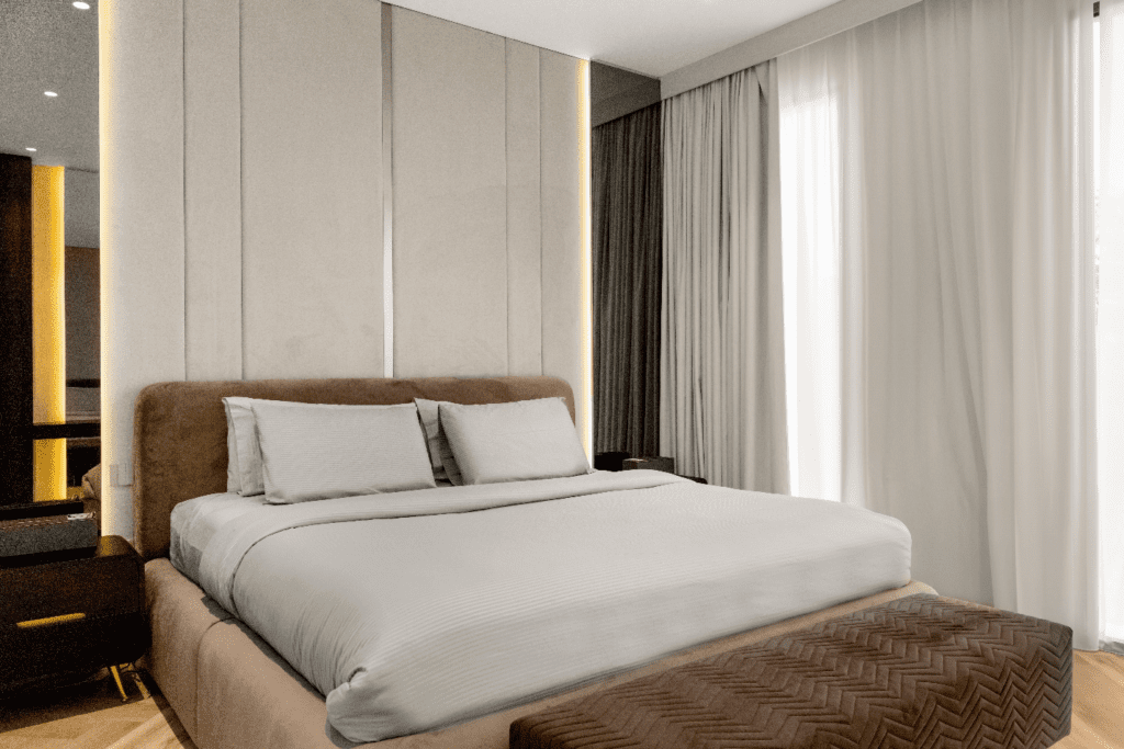
Deep neutrals like charcoal, espresso, and soft greige establish calm authority. They anchor the room, allowing architectural details and craftsmanship to stand out. These shades feel composed, elegant, and perfect for creating a sophisticated look.
Warm Tones: Inviting & Intimate
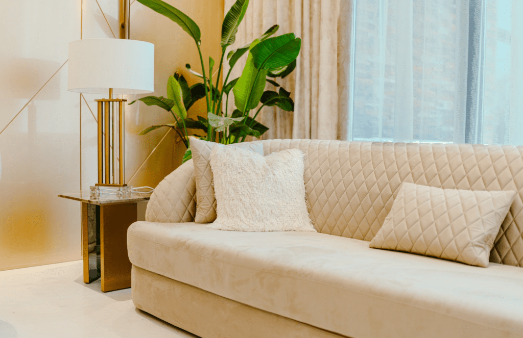
Velvets in warm taupe, cognac leather, and burnished gold undertones bring emotional warmth. Ideal for living rooms and private lounges, these colours encourage comfort and conversation. Paired with tactile fabrics, they make luxury smething you can both see and feel.
Cool Hues: Refined & Balanced
Sapphire blue, forest green, and slate grey evoke clarity and composure. Often used in executive seating or reading corners, these tones reflect confidence and balance. Green, especially, connects interiors with nature while maintaining a polished aesthetic.
Texture Shapes Perception
Colour doesn’t work alone; it works in tandem with texture.
- Velvet deepens darker shades and adds drama.
- Linen and bouclé soften bold colours for understated elegance.
- Leather introduces authenticity and timeless appeal.
Together, colour and texture create a layered sensory experience.
The Role of Lighting
Natural light reveals undertones and softness, while evening lighting deepens hues and adds richness. Understanding this interaction ensures upholstery looks intentional at every hour of the day.
When thoughtfully curated, upholstery becomes a visual signature aligning mood, material, and identity. In luxury interiors, colour is not just seen; it is felt.